In addition to wordles, here are two more often abused data visualizations, the periodic table and the subway map.
Both diagram methods are intended to show that among a set of entities, there are many subsets, for the most part mutually exclusive but they have informative intersections. Think of the Venn diagram as the canonical diagram of subset relations. A subway map should have very few intersections (only a handful of entities are in more than one subset, the interchanges or transfer stations). The periodic table has a lot more structure, in fact, as a special case two-dimensional table, the full set can be split into mutually exclusive subsets in two distinct ways.
Take for example the original periodic table.
(from
Science Notes)
What a great invention.
Mendeleev compiled a bunch of disparate facts, similarities of elements, into a single visualization. The dataviz wasn't perfect, because there were gaps. But the picture was almost a theory, an extrapolation from data, that by 'testing' (further exploration) was confirmed by elements that fit nicely in those gaps. There have been
attempts at organizing that chemical information in different ways but Mendeleev's holds primacy.
Nowadays, a periodic table is used for organizing a large set of items that have some similarities. Except the similarities have only tenuous systematic patterns. The point to the chemical table is that they fit nicely into rows and columns according to number of shells and number of electrons in outer shells (which predicts chemical properties nicely). The modern use of these periodic tables seem not to care what patterns in reality there are, just that pretty colors and list. Often the items in a column are not really related, and often they don't go from simple to weighty.
(from
Expand via pinterest http://www.xpand.com.au/ )
In this example, the table is simply chart junk. The colors specify the mutually exclusive subsets but the rows and columns say absolutely nothing about the entities.
The periodic table of dataviz has some attempt at using the structure appropriately in the far left and far right columns, but in between its a mess. The site is great for examples, I'm only criticizing the use of the periodic table as the viz method. Note that almost all periodic table viz's use lockstep the funny unbalanced form of the table rather than fit it to the data (the properties of the entities). Instead the entities are shoehorned usually without any reason at all.
The point to a periodic table is that everything in a row should somehow be similar, and everything in a column should also somehow be similar. Also there should be some kind of progression from simple to complex down a column.
When is it appropriate to have a periodic table? When your set of items has two clear dimensions. There can be lots of gaps, or more in one position than another. But the two dimensions need to be clear. Also use those labels! Make sure everything in a column needs to be related. The rows don't necessarily have to be exactly related but at least of roughly the same complexity.
---
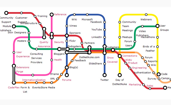
Subway maps are diagrams of connectivity of train systems. As a dataviz, they show that certain sets have a handful of points of intersection. Within a subset (shown by a line or track in the system) all the items are related. So when two lines intersect, that item must be a member of both subsets. Unfortunately, many 'subway' maps don't even bother with convention. They'll group items on a line that are only tenuously related, and then a 'transfer point' (an entity on two or more lines) ends up having little to do with either.
What makes a 'subway' map good is when the subsets have very few common entities. That will translate to only a few interchanges, making the diagram easier to create and less busy. It's a plus if you can order the entities along a line in a meaningful fashion (there is some inherent ordering).
Most uses of the 'subway map' dataviz, just like with the periodic table viz, either take a literal subway map (London's usually for obvious for obvious dataviz design homage) and shoehorn entities in, or make up their own but don't bother to make the lines and interchanges act like sets and intersections.
(from
Becoming a data scientist) Using some domain knowledge, the items on each colored line aren't very coherent subsets, and their interchanges aren't really common between the two intersecting lines. There is quite a bit of overlap among these entities, lots of subset relations and intersections, but they are unfortunately not even bothered with.
A subway map viz is appropriate for a set of entities if those entities separate nicely into mutually exclusive subsets, with a handful of single entity intersections. If there are many intersections, then there are many constraints on how the lines meet each other.
Consider each entity as as having a list of features. If all the entities have a single feature that partitions the set (these are the subway lines) with very few entities with more than one line (the transfers) then the subway map is appropriate. If all the entities have two features, each partitioning the set in two distinct ways, then a periodic table is appropriate.
These dataviz strategies may well be meaningless chart junk simply to display a list with some structure. They are certainly esthetically pleasing (just like wordles!), but for the most part used irrelevantly. Most lists of entities are easily separated into sublists, with little extra structure, r quite a lot of complicated structure. The subway viz is good is there is a very little bit of common properties. The periodic table is good if there are two mostly coherent discrete dimensions, they don't have to be numbers.
The primary complaint is that the template is ostensibly knowledge based (scientific looking, 'sciency') but that the data poured into them just doesn't have that structure; the structure is a red herring. The dataviz should add something, should give you knowledge about the entities. If the items are on the same subway line, they should have some commonality. An entity in a periodic table should be similar somehow to the other entities in the same column and also the same row.
The alternative, when there is not enough structure, is a simple set of lists. If there is too much structure (lots of common features with little discernible pattern) is to use a venn diagram which captures all the possible intersections.
Or maybe I'm just complaining about incoherent sets and it's not even at the level of the top level structure being a red herring. It's a red herring that it's a red herring.